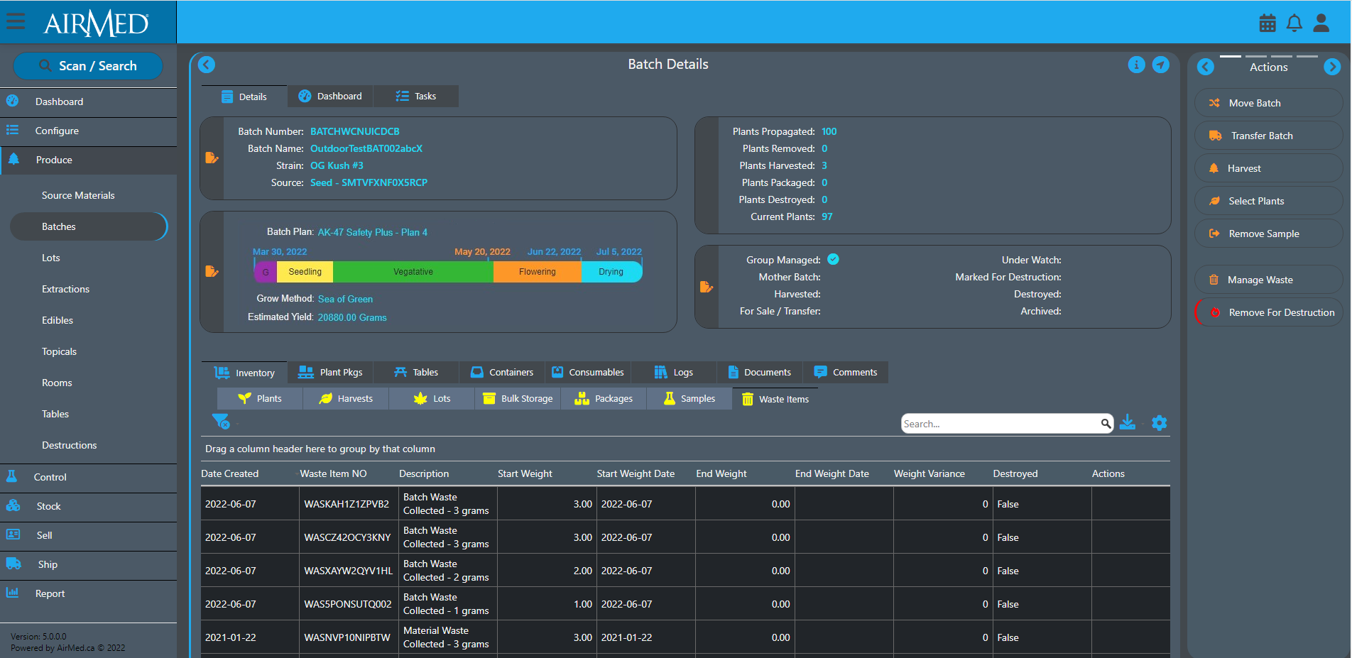
AirMed is getting a completely redesigned interface. AirMed5 will offer light and dark themes for use under bright lights in work areas such as grow rooms. When using the dark theme, less light is reflected from the screen to limit oversaturation from dark text on a light background.
The new look and feel will make it easier to process the information on screen and navigation lets users see where they are in the application at a glance. Infographics are being incorporated where applicable to display more details using less screen space.
We’re minimizing the number of clicks required to complete each step in a process. The actions menu is extended with a carousel, and a new grid control offers new options for viewing, sorting, searching, and grouping data. Columns can be rearranged to match a user’s preference, and settings are saved for future sessions.
And there’s so much more.
For more information on these new features or to book a demo of AirMed to see them for yourself, click the Request Demo button at the top of the page or use any of the contact forms.
In the meantime, visit https://airmedcloud.com/airmed-5-intro/
